Self-initiated study · Higher education · 2026
Turia InstituteDesign, technology and the city.
A university website for a fictional English-taught institute in Valencia, built in a language with almost nothing in common with Lanternhouse, then rebuilt after studying four European universities.
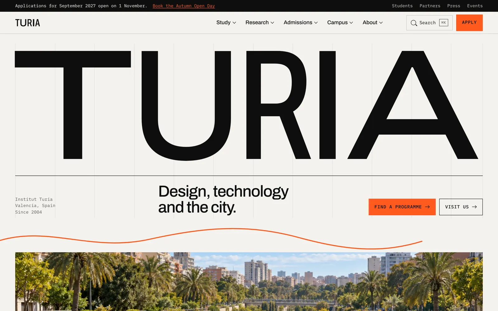
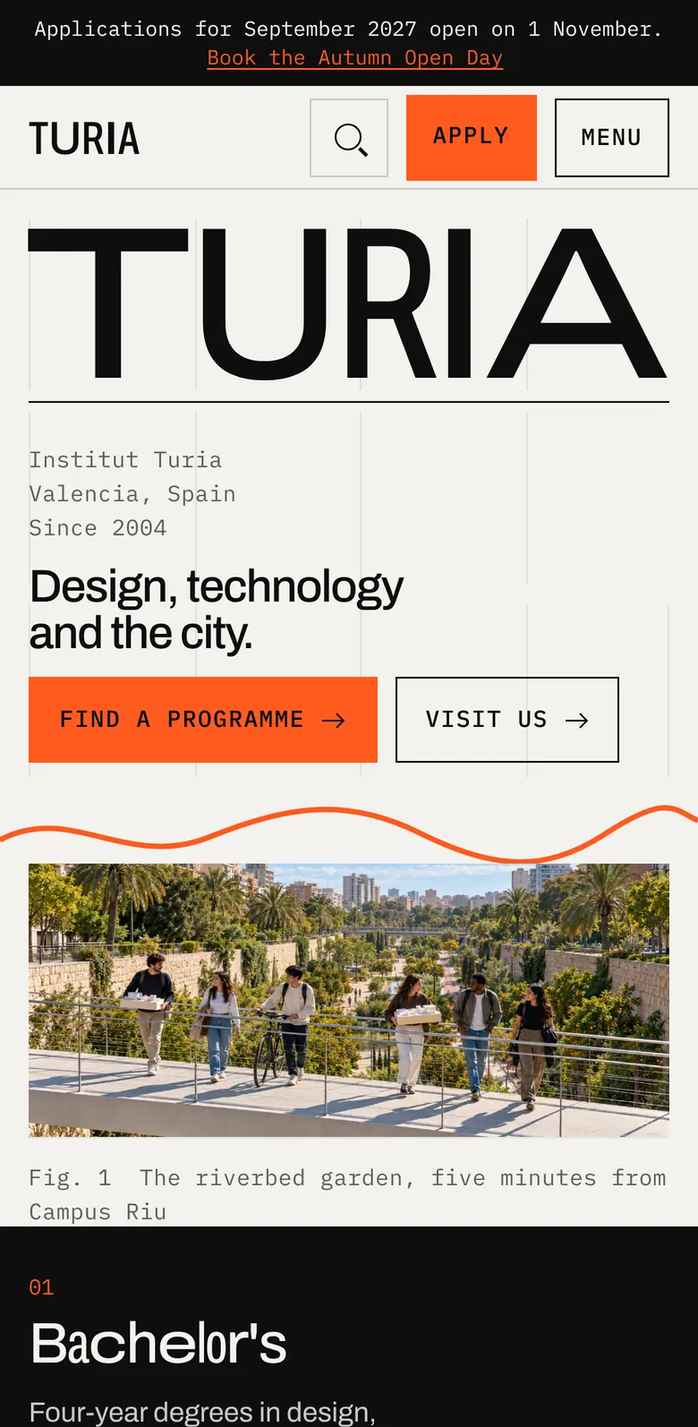
After Lanternhouse I wanted to test range rather than repeat myself: a different sector, a different audience and a visual language from the opposite end of the spectrum. Turia is a university of design, technology and the city, named after the river Valencia moved after the 1957 flood. Its identity borrows a method from one of the best university identities of the last decade, credited openly, and its structure came out of a side-by-side review of four real European universities.
- Organization
- Fictional, invented for this study
- Role
- Brief, research, content, art direction, design and development
- Platform
- Python static generator (standard library only), hand-written CSS and JavaScript, Vercel
- Built
- October 2026; version 3 followed the benchmark review
- Language
- English, the institute's teaching language
Two ways to read this. Every chapter opens in plain language: what changed, and for whom. Technical readers can open Under the hood for the engineering.
The brief
Design a credible university site for prospective students, parents, international applicants and research partners, in a visual language unlike anything else in this portfolio.
The method
Borrow a proven idea openly, test the structure against four real universities, adopt what serves visitors, and write down what I chose not to adopt, and why.
What it shows
Range across sectors and styles, research that changes the build, and engineering rules carried from one project to the next instead of relearned.
The brief
The same rigour, and nothing else in common
Lanternhouse speaks to one person in a hard moment. A university speaks to many people making a long decision: an 18-year-old comparing programmes, a parent checking costs, an applicant from Accra asking about visas, a city council looking for a research partner.
I wanted the second study to prove range, so I chose the opposite of Lanternhouse on purpose: daylight instead of dusk, a typographic identity instead of a photographic one, black and white with a single orange instead of blue and yellow.
The scope matched a real institution: fourteen programmes from bachelor's to doctoral, five schools, four research labs, admissions with fees and funding, two campuses, news, events and leadership.
- A second sector, audience and visual language
- A full academic structure, not a home page and three tabs
- A real place, a fictional institution: Valencia, its river garden and its port
Under the hoodFor technical readers
- Every word on the site, the image registry and the photography shot briefs live in one Python content file.
- The generator uses only the Python standard library, so the build has nothing to install.
- The shot-brief document is regenerated from the same content file, so briefs and pages never drift apart.
- noindex on every page, and a footer line naming the institution as fictional.
Identity
A typeface programmed to be different every time
The identity follows a method Pentagram used for The New School in 2015: one typeface drawn in several widths and programmed so each letter takes a different width. I name the reference openly. The point was to learn how a system like that behaves on the web, not to pass it off as my idea.
On Turia, the width axis of the Archivo variable font does the work. A small function gives each letter a width from a hash of the word, so every school, lab and page gets its own repeatable logotype from the same font. Hover over one and the widths reshuffle.
Everything else stays quiet: black, white and warm paper, with one signal orange. A single orange line meanders under the hero and through the campus map. It stands for the Turia, the river the city moved.
- One variable font, endless repeatable logotypes
- A credited reference, not a borrowed look
- One accent colour, kept for action and the river line
Under the hoodFor technical readers
- Archivo variable, width axis 62% to 125%; widths assigned at build time by a deterministic hash of each word.
- Home and footer wordmarks fitted to the container in JavaScript once fonts have loaded.
- The river line is one SVG path drawn on load, skipped under reduced motion.
- Large headings at weight 430 to 450 and body copy at 18 px on a 1.6 line height, set after the benchmark review.
Research
Four universities, studied before version 3
Before the third version I reviewed four European university sites on the same morning, at desktop and phone sizes: Aalto University, ETH Zürich, the University of Cambridge and the Royal College of Art. Oxford and University of the Arts London were my first choices, but both block automated visits, so the closest equivalents stood in.
For each one I wrote down what it does well and why it works, then decided pattern by pattern what Turia should adopt. Just as useful is the list of what I left out: cookie banners, because Turia sets no cookies; extra accent colours; and carousels for primary content.
The review changed the build. The biggest single improvement came straight out of it: sending each audience to its next step directly under the hero.
- Same-day captures at 1440 and 390 pixels
- Every adopted pattern traced to its source
- A written list of patterns rejected, and why
Under the hoodFor technical readers
- Adopted from Cambridge and Aalto: audience pathways. From Aalto: split story panels with arrow-link stacks. From ETH and Aalto: a utility bar and a mega menu with a featured story.
- Adopted from the RCA: visible column hairlines, caption tabs cut into photographs, and statistics with small units and a cited source.
- Adopted from all four: sticky in-page navigation with scroll-spy on programme pages, and a legal notice page, as Spanish law (the LSSI) expects.
- The review lives as a document beside the code, so the reasoning outlives the build.
Wayfinding
Every audience, one click from its next step
Under the hero sit four routes: Bachelor's, Master's, Doctoral and International. Each offers two concrete next steps, so a school leaver, a researcher and an applicant from abroad all leave the first screen knowing where to go.
The programme index is a Swiss-style typographic list you can search and filter by level and school, with a photograph that follows the pointer on desktop. On desktop, a mega menu groups links the way visitors think about them and gives one slot to a featured story.
- Four audience routes before the first scroll
- Fourteen programmes, searchable and filterable
- A mega menu organised by visitor, not by org chart
Under the hoodFor technical readers
- Filter buttons use aria-pressed, and a live region announces the number of programmes shown.
- Every programme is a plain link in the static HTML; filtering only hides and shows rows.
- The pointer-following preview runs only on devices that hover, and never on touch.
Programme pages
The questions applicants actually ask
Programme pages are built around what an applicant needs to decide: what you will study, semester by semester; where it leads; entry requirements; fees; and key dates, with the apply button always in view. A sticky in-page navigation shows where you are as you read.
Cost is usually the question nobody answers clearly, so the fees page has a calculator. Choose a programme, fee status, housing and any scholarship, and it estimates the year in euros, with every line shown.
International applicants get their own route: visas, housing, arrival and an honest picture of living in Valencia.
- Semester-by-semester structure on every programme
- A cost-of-the-year calculator with every line visible
- A dedicated route for international applicants
Under the hoodFor technical readers
- The calculator is a plain HTML form enhanced by JavaScript; native selects and a range input keep keyboard and screen-reader behaviour.
- Fees, housing bands and scholarships live in the content file, so an admissions office would update them in one place.
- Scroll-spy uses IntersectionObserver and updates aria-current on the in-page links.
Research and news
Research a city can see itself in
Four labs work on questions a hotter, wetter Mediterranean is asking: water, heat, human-centred AI and the port. Each lab page opens with a plain-language question, then the people, projects and partners behind it.
One story needed particular care. In October 2024 real floods devastated towns south of Valencia. The Water Lab's news story is about listening to residents and rebuilding, and its photography brief rules out disaster imagery entirely.
Statistics carry a small cited source beneath them, a pattern taken from the RCA, so that in a real build every figure has an owner.
- Four labs, each led by a plain-language question
- A real tragedy handled with restraint
- Every statistic paired with its source
Under the hoodFor technical readers
- Lab cards hang their photographs over the card edge, inside a static clip so nothing escapes in Safari.
- Category tabs and caption tabs cut into photographs, sized to stay legible at 390 px.
- The flood story's shot brief specifies residents, archives and daylight, and no damage.
Art direction
Mediterranean light, by written direction
Turia's photographs live in a different world from Lanternhouse: hard late-morning sun, crisp shadows, white concrete, glazed tile, orange trees and the long garden in the old riverbed. No film grain, no famous landmarks and no readable signs.
Forty-three images were art-directed from written shot briefs. The portraits were made in their own session, with one beam of window light against a lime-plaster wall, so leadership and students read as one series.
Until photography existed, every image slot showed a hatched placeholder with its file name and ratio, so the site looked deliberate at every stage of the build.
- A second house style, deliberately opposite the first
- A portrait series lit and framed identically
- Placeholders designed as part of the system
Under the hoodFor technical readers
- Originals pulled from a shared folder by file ID on every build; if access fails, the build falls back to placeholders instead of breaking.
- A crop script writes each image to its ratio, with a per-image vertical focus point, at 800 and 1600 px in WebP.
- Wide 21:9 crops are cut from 3:2 originals, so the shot briefs keep every subject in the middle band.
Engineering
Rules carried forward, not relearned
The lessons from Lanternhouse were rules here from the first day: photographs only fade and move, every frame uses a static clip so nothing escapes in Safari, nothing animates a blur, and reduced motion removes all movement.
The site sets no cookies and loads no analytics, so it needs no cookie banner, and says so. A legal notice page is there because Spanish law expects one on any site run from Spain.
That carry-over is the part that matters to a team: what I learn on one project becomes a written standard on the next, where the next person can find it.
- Motion rules inherited from the first study
- No cookies, so no banner
- A legal notice page, as Spanish law expects
Under the hoodFor technical readers
- Static HTML generated by Python with no runtime dependencies: one stylesheet and one progressive-enhancement script.
- HSTS with preload, a restrictive Permissions Policy and a strict referrer policy.
- A README documents structure, build order and the image pipeline, so another developer could pick it up.
Quality
What an honest audit found
The same automated check I ran on Lanternhouse (axe-core, WCAG 2.2 AA rules, ten pages at desktop and phone sizes) came back clean on most pages, with two small findings: the desktop search button's accessible name doesn't include its visible text, and one step number on the admissions page is slightly short of contrast on phones.
Two trade-offs are worth naming. The home page wordmark settles into place on load, which moves the layout on desktop more than I would accept at a client launch; reserving its final size fixes that. And the typeface loads from a public CDN, the only request to another domain. Self-hosting it is a small change.
The home page is also long, about 12,000 pixels on desktop. Every section earns its place, but a real institution should test whether the labs grid and the facts band could move to their own pages without costing visits to the programme finder.
- Two small accessibility findings, both easy fixes
- One layout-shift issue, with a known cause
- One open question a real team should test
Under the hoodFor technical readers
- axe-core 4 with Playwright across 20 page loads (10 pages, desktop and phone).
- Findings: label-content-name-mismatch on the search button (desktop); color-contrast on one admissions step number (phone).
- Home page layout shift measured at about 0.2 on desktop, from the wordmark fit; every other page tested measured under 0.01.
- One third-party host: a public CDN serving the Archivo variable font. No horizontal overflow on any of the 20 loads.
Take it with you
The full story, on paper.
The full design brief and a one-page summary, written for teams deciding whether I'm the right partner.