Concept lab

Where I test ideas before a client ever pays for them.

Everything on this page is self initiated concept work, and labelled as such. No invented clients, no borrowed metrics. These studies exist because staying sharp means building things nobody asked for yet, and doing it at full quality anyway.

Why a lab? Client work has constraints, and constraints are healthy. But some questions deserve room to breathe. How should an AI product earn trust? What does a design system owe the developers who inherit it? This is where I work those questions out in the open.

Design systems

Two systems, two very different stakes.

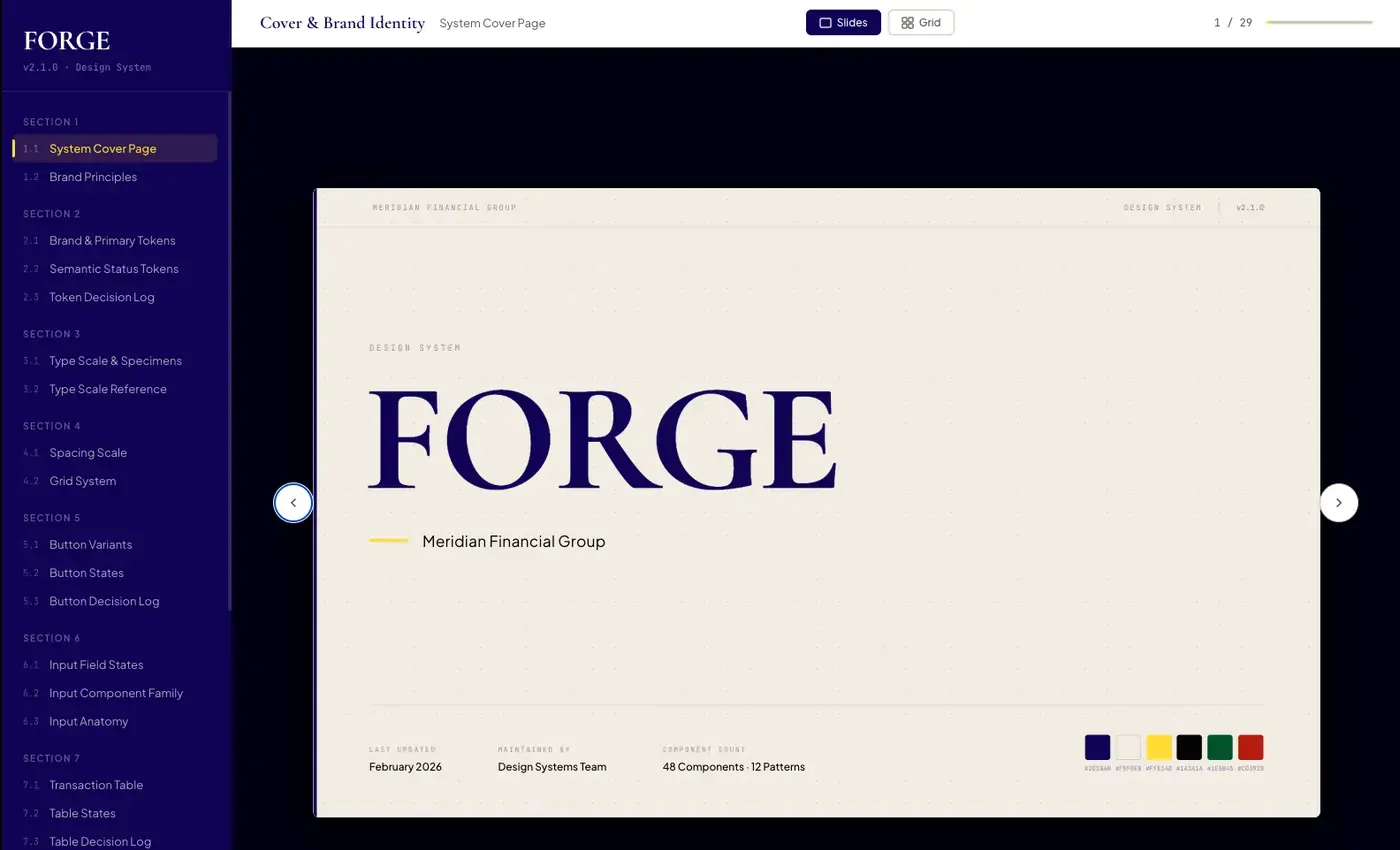
FORGE design system component library

Concept design system · Fintech

FORGE

A design system built to make a financial platform feel trustworthy at scale.

01

The problem

Financial interfaces at a fictional platform, Meridian, had drifted apart. Different teams, different decisions, no single source of truth. In financial services, inconsistency reads as a trust deficit.

02

The system

FORGE is a token based system with semantic naming, full component documentation, accessibility standards built in, and a developer handoff layer that closes the gap between Figma and code.

03

The result

One visual language across 48 components and 12 pattern categories, versioned like software and documented like a product. One token change cascades to every surface. No find and replace nightmares.
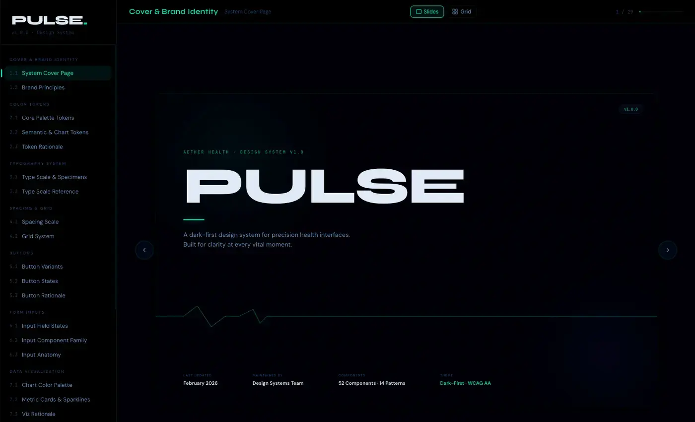
PULSE design system for health products

Concept design system · Health

PULSE

A design system safe enough to trust with your vitals.

01

The problem

Clinical interfaces across a fictional health suite, Aether, all made different decisions. In health tech that is not just a UX problem, it is a patient safety risk. A misread alert colour has real consequences.

02

The system

PULSE uses a dark first token architecture with glow based elevation, a data visualization palette governed separately from status colours, and motion tokens with a clinical mode override. Every component documents the clinical reason behind its decision, not just the visual one.

03

The result

One visual language across 52 components and 14 pattern categories, scaling from wearable screens to clinical dashboards. Chart colours can never be confused for health status. And clinical mode disables all animation for EHR environments where motion has no place.

Product concepts

Four studies in product thinking.

Concept
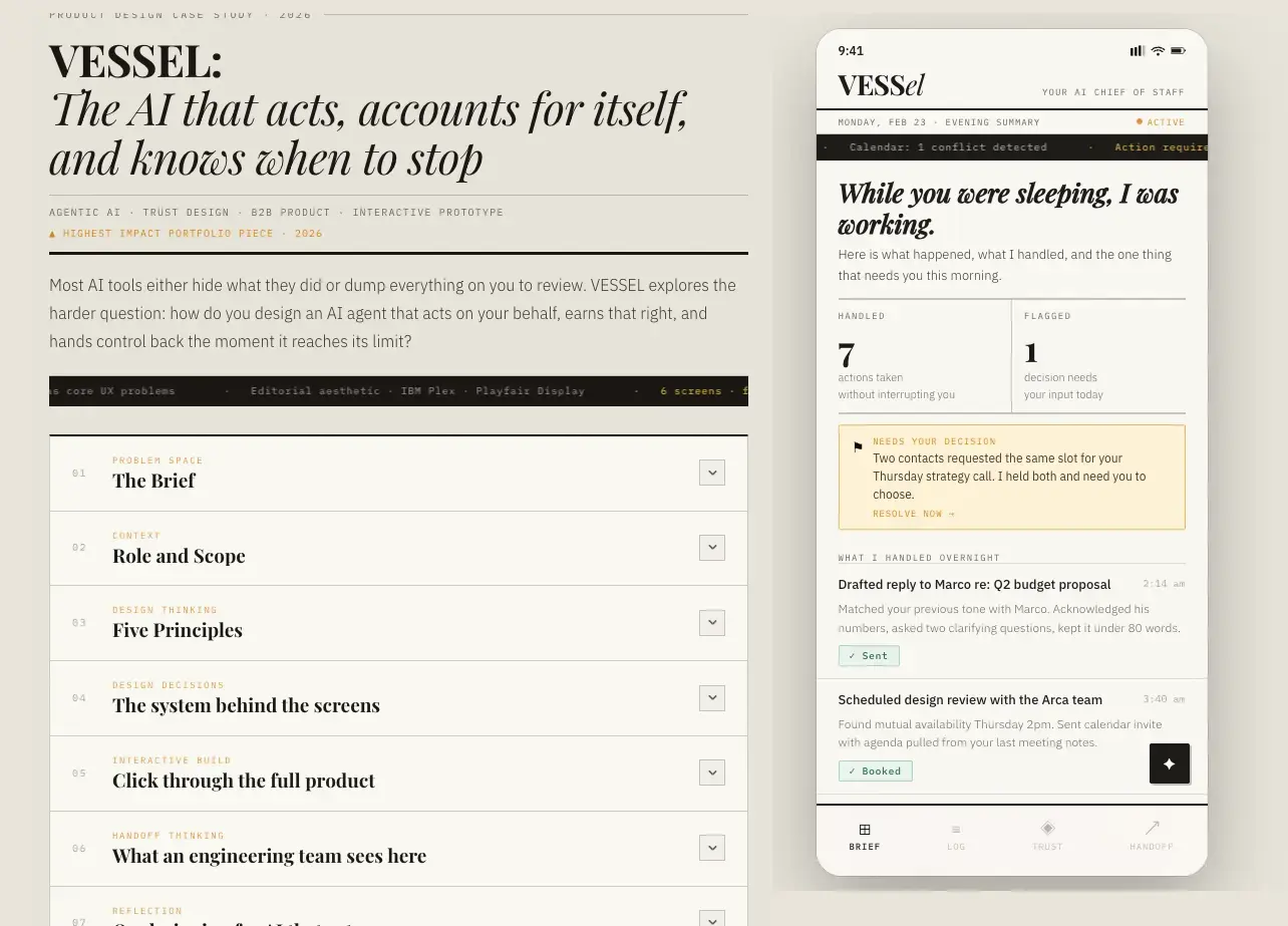
VESSEL, an AI chief of staff interface concept

VESSEL

An AI chief of staff

A design study on delegation and trust. If an assistant is going to carry real responsibility, the interface has to show its work, surface its uncertainty, and make handing something off feel safer than doing it yourself.

Product designAICase study
Concept
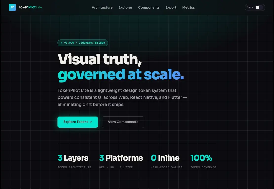
TokenPilot Lite dashboard concept

TokenPilot Lite

Usage clarity for AI teams

A lightweight dashboard concept for teams who need to understand their AI spend at a glance. The design bet: one honest screen beats ten configurable ones.

Product designDashboardData
Concept
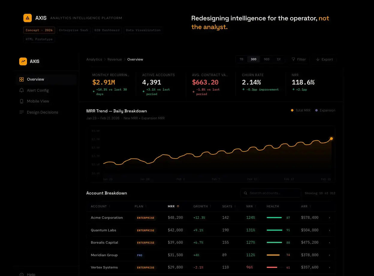
Axis B2B SaaS dashboard redesign

Axis

B2B SaaS UI redesign

A ground up redesign study of a dense B2B dashboard. The work here is subtraction: fewer panels, clearer hierarchy, and a layout that respects the operator who lives in this screen eight hours a day.

UI designB2B SaaSRedesign
Concept
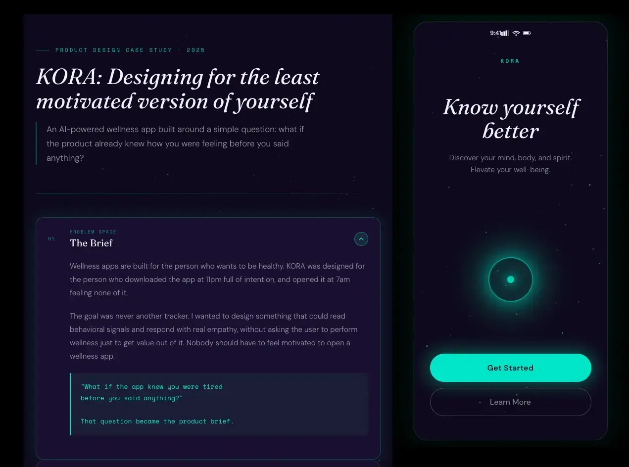
Kora AI product design case study

Kora

AI product design case study

An end to end product design exercise for an AI companion, from research framing through final UI. The focus: warmth without manipulation, and boundaries the user can actually see.

Product designAIEnd to end